Design System
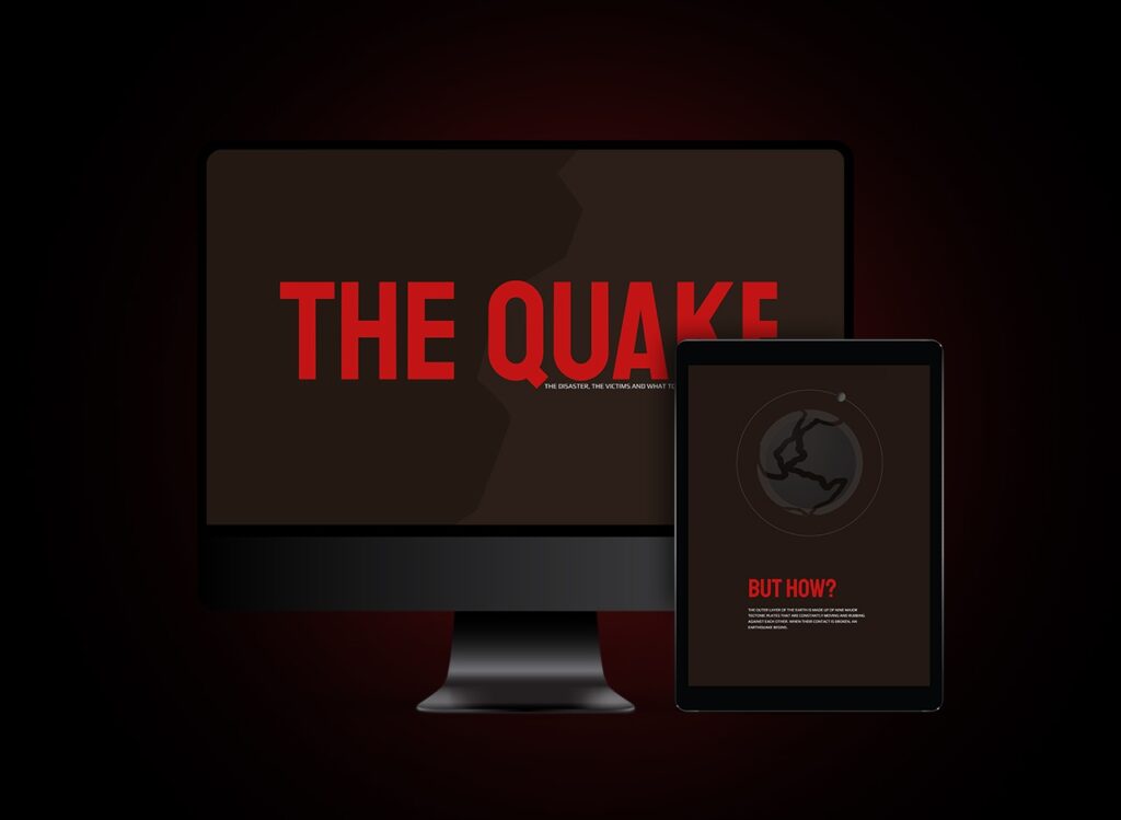
The choice of color palette for The Quake’s design style was a result of careful consideration and analysis. Earthy brown and warning red were selected for their ability to evoke feelings of stability, caution, and preparedness in users.
This design style is deliberately clean and uncluttered to allow for a seamless user experience.
Animations
The use of animations on the website adds a new level of interactivity and engagement for users. As they navigate through earthquake data, the animations activate to provide a visual representation of seismic activity, enhancing users’ understanding of the information presented.

Award winning website
TheQuake website’s exceptional design and user experience were recognized in 2022 when it won first place in the Experimental category of the Elementor Showoff competition.
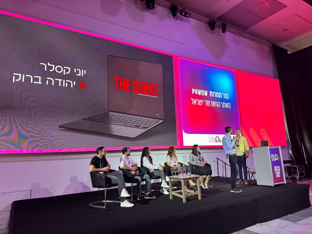
It also secured victory in the Press4Wow competition at the Press4Web yearly conference and earned the remarkable Awwwards Honors title.
