Logo
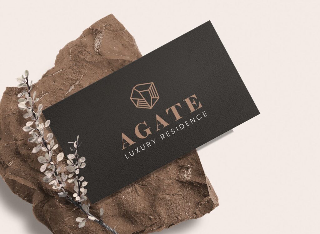
The Agate logo is designed according to the architectural structure of the project and to the shape of the Agate gem that the building called after.
Also, the brand colors, Dark Brown and Beige, also match the color of the Agate gem.
Finally, the font has been chosen carefully to blend nicely with the elegant character of the building.
Website
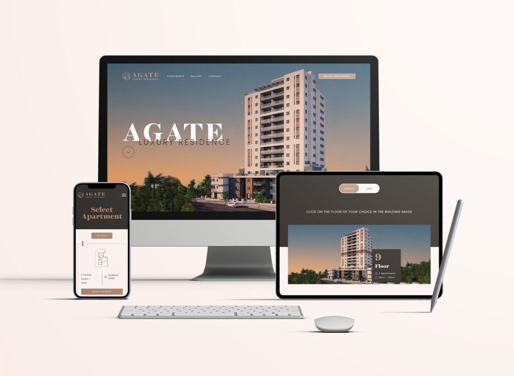
The Agate website was designed with great precision in line with the brand’s guidelines.
Also, it was built especially for the digital age and for the younger generation. Today everyone needs everything now and immediately and the website gives the clients an opportunity to see as much detail as possible about the apartment they are interested in.
The website has a special visual system that has been built and developed to select apartments that helps the user easily navigate between the floors and apartments in the building.


Visual Branding
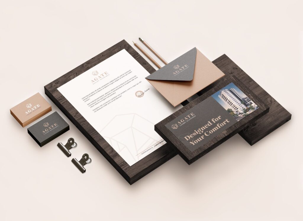
The Agate project also included the creation of a perfect design language that continues the branding line and gives a sense of one complete and beautiful product.
