
The Quake
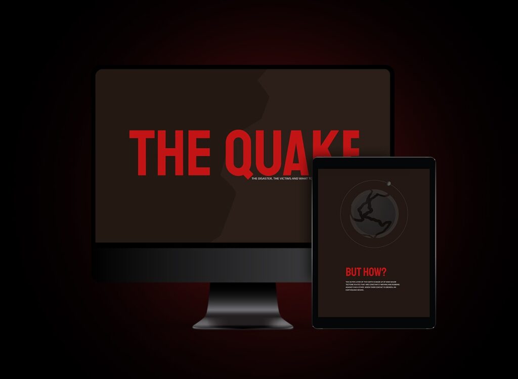
Design System The choice of color palette for The Quake’s design style was a result of careful consideration and analysis. Earthy brown and warning red were selected for their ability to evoke feelings of stability, caution, and preparedness in users. This design style is deliberately clean and uncluttered to allow for a seamless user experience. […]
Ariel Architect
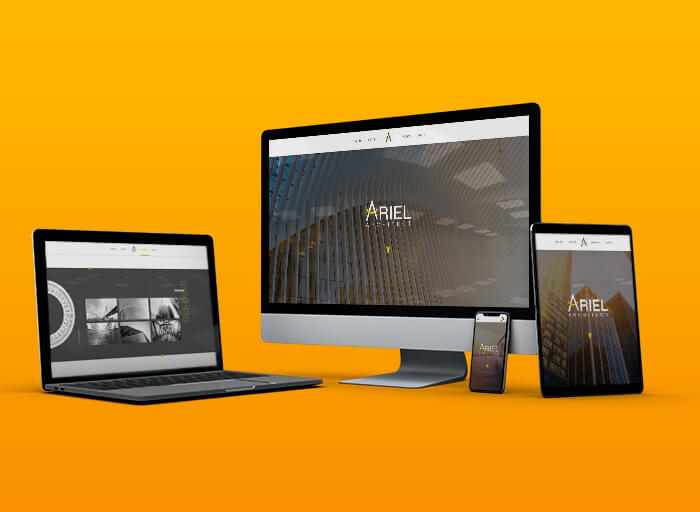
Logo Ariel’s logo was designed according to the field of architecture. The logo includes a combination of three architectural elements within the letter A of Ariel: pencil, ruler, and caliper. The colors of the logo were chosen according to the colors of the construction tools. Also, the straight and angular font fits Ariel’s modern architectural […]
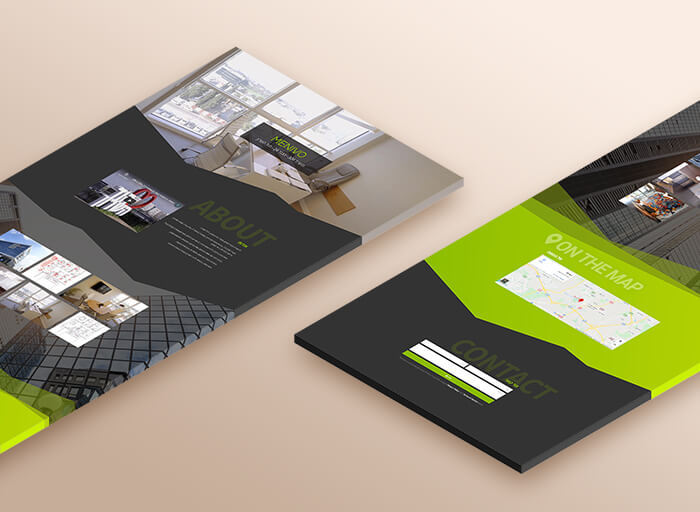
Menivo
Visit Website
Notza
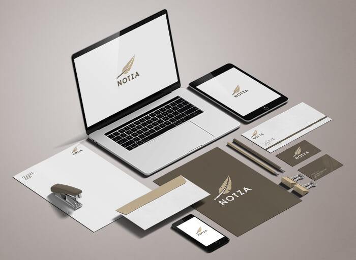
Logo As you can see, the logo has a feather when the feather spine is made up of a sewing needle that connects the logo to the world of textiles and fabrics. The colors of the logo, beige and dark brown, create a combination that conveys a sense of calm and delicate luxury. The straight […]
Logicode
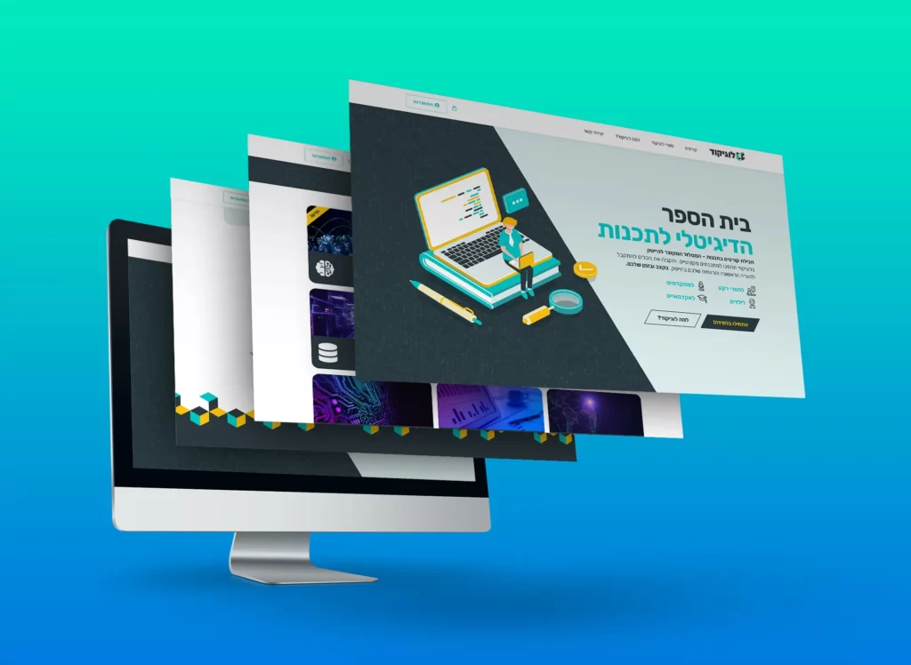
Logo The logo embodies the essence of innovation and simplicity, featuring interlocking 3D Tetris cubes forming the letters “LC.” The color palette is a harmonious blend of the worlds of programming and play, exuding a sense of both sophistication and approachability. The font, with its rounded yet square form, perfectly complements the geometric logo design […]
Agate
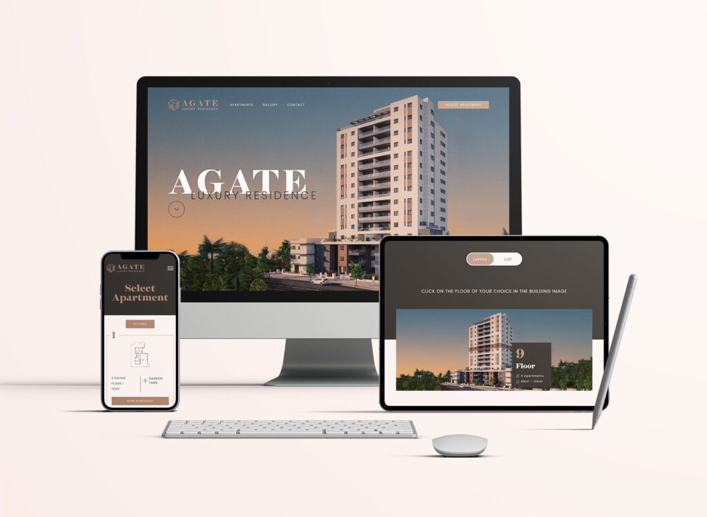
Logo The Agate logo is designed according to the architectural structure of the project and to the shape of the Agate gem that the building called after. Also, the brand colors, Dark Brown and Beige, also match the color of the Agate gem. Finally, the font has been chosen carefully to blend nicely with the […]